|
For me, an interest in book design goes fundamentally hand in hand with the joy of reading or treasuring a book. I am reminded of my childhood fascination with books and the emotional effect a new book had on me when I received it. The same feeling is still prevalent for me today at the point of buying or discovering a book that appeals to me.
What does the reading public expect of locally published books? Do they compare the packaging of local books with those of their favourite international authors? Do they spend time on the design of a book? The cover? The type on the inside? The page layout? Paper quality and colour? The width of the margins? Have the differences in the readability of books been appreciated? How much time do we spend on the credits on the imprint page? Are readers interested in knowing who designed a book? Do they realise that book design involves not only the cover, but also the layout of text and images on the inside?
Given the subjective nature of graphic design, all the opinions expressed in this article are my own. There are always many different ways of solving a design problem, ie communicating on/in whatever medium the brief states. On top of that different people have different tastes in design and are intrigued visually by a variety of opposing things. One of the many dangers any experienced publisher or editor will be able to confirm is the fear of alienating their market with a cover that could be seen as "outrageous", "too strange" or "experimental", or not fitting for the nature of the book's subject matter. It is important for the designer to stay aware of the fact that she/he is not creating fine art but is, rather, involved in an important part of communication - i.e. communicating with a market, that could make them obsolete if that market falls away.
It just so happens that the book cover (or jacket) is the most exciting canvas that I have encountered in my very young career. And I definitely do not presume to be a master of the topic. How can you enjoy something if you know everything about it and there is nothing left to learn? All these thoughts are born from the fact that books and book design have the ability to move and fascinate me.
I work part-time in a bookstore - something I've wanted to do ever since I can remember. When I was stuck for a job in the UK, the money I could make at the restaurant where I started working was more than the initial hourly rate at the bookstore I approached. Those were times when I had to choose between buying something to eat and tobacco. I ended up working in the same restaurant for the whole two years I was there, but spent a lot of time browsing in the different bookstores and libraries.
A highlight was definitely being in Waterstone's in Piccadilly, London - the evening in mid-October 1999 when JM Coetzee was awarded the Booker Prize, the first time an author had received the prize for a second time. It was the same store soon after that where I bought a beautiful hardcover novel of a Dutch author translated into English. The only reason was the packaging.
I was determined that when I returned to South Africa I would not pursue a career as an engineer, and two weeks before leaving England decided to explore the possibility of studying graphic design. I started working in a bookstore in Cape Town's V&A Waterfront towards the end of my first year as graphic design student.
Designing books became a serious interest as I continued working in the Waterfront and following a design course. I was inspired by the design of overseas books that I had perused in the evenings after spending a day at college. There were far fewer locally published books in the bookstore than imported ones, but I reasoned that somewhere, somehow, there had to be people making a career out of what I wanted to do - designing books.
Designing a book is an opportunity to create a functional object of beauty. A well-designed book has integrity and seems to be a unique entity with a potential lifespan of many years. To meet a book collector who knows the value of a book because of its uniqueness is fascinating. The reasons why different people collect different books are very interesting and sometimes very personal. No one needs to convince a collector of the importance of caring for books. This article is not about book collecting. But realising the importance of book design already gives one a sense of a book's potential value as a collector's item.
Type
Different typefaces seem to signify different genres, specifically
with regard to the fiction titles of overseas publishers with much
bigger outputs than South African publishers. This is clearly noticeable
in the wide range of crime or thriller titles available. DIN Schriften
(the typeface most commonly used on signboards along South Africa's
main roadways) and Trajan have been consistently popular over the
past few years in this genre. Another example, but this time combined
with the use of artwork/illustration/colours, is to be found in
the sci-fi and fantasy sections of bookstores. Faces like Manson
and Citizen (both from the San Francisco foundry Emigre) are regularly
used here.
Whether customers are on the lookout for these books by title
or by author, the fact that such books so often have a consistent
appearance must, on some level, ensure that they can be identified
more easily by potential buyers.
Type is often used as a means to integrate the cover of a book
with the inside pages. It is indeed a pleasant feeling when it
is evident that someone went to the trouble of making sure one
or more elements of the cover connect visually with the inside
of the book. Type provides an ideal way to do this - even in the
simple situation where the title type on the cover is repeated
on the title and half-title pages.
To read a book is supposed to be pleasant and as easy as possible
on the eye. The opinion that typesetting is an invisible art seems
to resonate here. The shape of letters and their formation of
words should not bother the reader or cause him/her to slow down.
In the introduction to Lewis Blackwell's recently revised edition
of 20th Century Type (Laurence King, 2004) Blackwell hints
at the "arcane" nature of typography as part of its attraction
and the reason why people become irrationally obsessed with it.
On the one hand, words and their shapes and different letter forms
are visible on the printed page of a book. But on the other hand
it is the designer's job to make those aspects "invisible" and
"inconspicuous" to facilitate the flowing of the reading process.
An example here is the difference between a book set in a serif
or sans-serif face. Serifs are those lines that finish off the
strokes of letters. A sans-serif face don't have any serifs and
letters of this type often have strokes ending in sharp edges.
It makes sense to use sans-serif type in a cookery book, for example,
to make a recipe stand out from and contrast with a description
or discussion of cooking techniques, that might be set in a serif
type. But one of the functions of serifs is to lead the eye along
to glide as smoothly as possible over the text. It is sometimes
interesting to read a book set in a sans serif typeface. For example,
the series of Jeff Noon titles published by Black Swan, uses no
serif type, but a very integrated design has been executed with
the use of different weights of classic sans-serif Helvetica.
The typeface DIN Schriften that was mentioned earlier is a very
clean and clear sans-serif, and therefore it is not strange that
it is so commonly used on road signs, where legibility is important
and information has to be conveyed without ambiguity.
Type can be used to generate different moods or feelings in a
design. With a serif face a classical feeling with gravitas could
be the result, where a sans serif could be employed to "speak"
to an audience that expect something more contemporary or young
and ballsy.
It is lovely to note the last page of many of Bloomsbury's contemporary
fiction publications. There is usually a little paragraph with
the heading "A Note on the Type", where a short history and the
origin of the typeface used inside the book is provided. Maybe
they see it as a chance to educate readers on the use of type.
It certainly links with the earlier points made about integrated
book design. It also draws attention to the huge contributions
type designers have made during the last century - often overlooked
or taken for granted if you are not a typophile.
A little trip through the book store, on the lookout
for interesting and beautiful titles
In the African fiction and non-fiction sections there have appeared,
over the past three or four years, quite a few books published by
the Gauteng-based publisher Jacana. Often they have made use of
the extremely competent Durban design studio Disturbance Design,
headed by Richard Hart. The covers of these books jump out at you
with their use of colour, choice and use of images, manipulated
type and all-round depth of craft. Check out: Discovering Home,
A Life of One's Own, Felix Greenspan, They're Burning
the Churches, A is for Ancestors, Johannesburg Portraits
and many more.
Another South African designer/illustrator is Audrey Botha. She
has done work for the David Phillip imprint Ink Ink. Three titles
that stand out are Pieter-Dirk Uys's novel Trekking to Teema,
Muzi Kuzwayo's Marketing Through Mud and Dust, and Sello
Duiker's disturbing Thirteen Cents. These seem to stand
out from many other locally published books in terms of cover
design. Botha's use of colour, texture and composition is superb.
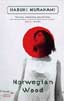
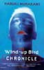
The designer Jamie Keenan has done extensive work for Harvill
and Routledge Publishers. His series design for Routledge's Classics
stand out and will endure well into the future. Simple images
combined with unexpected colours and strong layout results in
exciting decoration for many a bookshelf. His individual designs
for Harvill's Murakami covers are very enigmatic and fitting.
Check out: Dreams, Popper, Norwegian Wood
and The Wind-up Bird Chronicle.
New fiction often delivers the latest treasure from both prominent
and relatively unknown UK authors, published by Bloomsbury. The
head of Bloomsbury's design department is William Webb. Together
with Nathan Burton they have been responsible for some of the
most rewarding book covers over the past four years. Webb manages
to convey feelings very sensitively with his crisp use of type
and gentle imagery. Burton loves to use white borders along the
edges of the covers he designs. Often these are used in conjunction
with impeccably executed digital illustrations also done by him.
The results are invariably fresh and intriguing. Bloomsbury's
best has to be some of the work that is done using the UK illustrator
Michelle Thompson's illustrations. Her colour sense lends itself
to the creation of wonderfully moody and emotive work. Check out:
Fugitive Pieces, Honey Trap, Aloft, Dr
Mukti and other Tales of Woe, Anil's Ghost, the Nadine
Gordimer books (with cover illustrations by Ali Campbell), Soft,
The Insult and loads more.
Then there are all the surprises that delight one regularly and
without warning. Recent examples: Jonathan Cape's hard cover of
Adam Thirwell's novel Politics; Alex Garland's new novel,
Coma; José Saramago's new book The Double; Jasper
Fforde's new novel Something Rotten; Julie Myerson's Something
Might Happen; the new paperback version of Ben Richards's
latest book The Mermaid and the Drunks, and many others.
For me, a book with an attractive cover or dust-jacket remains
one of the most treasured possessions and joys. Working in a bookstore
is sometimes overwhelming because of all the exposure to a wide
range of titles and design - the input can be over-stimulating.
It is often pleasant to interact with customers who buy a copy
of a book by a favourite author and to become excited about their
recommendations and interests.
Watching customers make choices when purchasing books is fascinating.
People follow trends and are definitely influenced by reviews
in the printed media and on the radio. One finds people who are
interested in seemingly the most obscure subjects and often they
make it clear to the bookseller that they are experts on the topic
and by implication you as a bookseller lack an education. You
also find really pleasant people interested in what the staff
read and they are usually more than willing to follow recommendations.
It is surprising to note how rarely people seem to spend time
on appraising the covers of books inside a bookstore. Is it really
far-fetched to think that customers could buy a book simply because
the cover attracts them? Maybe they spend more time on the packaging
after the point of purchase - which would be strange, because
many people besides a designer are involved in producing the final
cover of a book. Editors and marketing teams all have their say
in the process, and they are intent on having packaging that will
ensure sales.
Attached to this article are jpeg image files of the front covers
of a few books that excited me when I discovered them. Most of
them were mentioned earlier. Some have become treasured possessions
and live on my bookshelf, read or still to be read. A cover like
that of Review's paperback version of Ben Richards's A Sweetheart
Deal will continue to inspire me to read, design and explore
books.
|


 Michiel Botha: I am 30 years old and have studied
mechanical engineering, wood science and graphic design. At this point
I have been a bookseller for three years at Exclusive Books in the
V&A Waterfront, and have been designing books at Alinea Studio, Cape
Town, for nearly two years.
Michiel Botha: I am 30 years old and have studied
mechanical engineering, wood science and graphic design. At this point
I have been a bookseller for three years at Exclusive Books in the
V&A Waterfront, and have been designing books at Alinea Studio, Cape
Town, for nearly two years.